005: BUILDING THE BRAND, PART II
After a mad dash to get the prototypes ready for their first content shoot at The Parcel with our friends (see 004: Group Getaway), it was time to review, reassess, and refine.
Having a group of creative, marketing-minded friends certainly helped provide valuable feedback and fresh perspectives on something I've been too close to for the past few weeks.
What initially felt like a never-ending exploration of typefaces in search of that special ‘70s “Up North” Michigan cottage vibe for the logo and brand typeface, I struggled to find it. The first iteration was a decent start, but I knew it didn’t quite hit the mark.
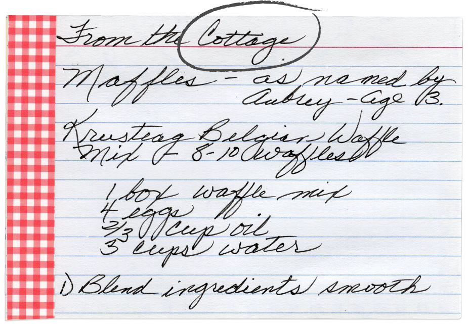
After sitting on it over the weekend, the answer was right in front of me: Grandma Joyce’s cursive. She always wrote the most beautiful cards and notes to us. Nothing would encapsulate the warm, genuine feeling of The Cottage more than her handwriting.
I spent some time scanning several handwritten notes and family recipes that she had passed down to us grandkids to study her pen strokes and dust off my cursive in an attempt to recreate her handwriting. It was not easy!
With some simplification, thickening of line weights, and a balanced composition with Cocogoose Pro typeface, it started to come together enough to get cranking on the next iteration of the tin label.
This is the part of the design process that could really prolong things. I could continue to tinker, tweak, and then completely start over 10x if I didn’t have a (self-imposed) deadline to get these out to folks before the summer season passes us by.
I quickly breezed through a handful of slightly different label options before pulling in Andrew at Morningsong and then my wifey/partner Kendra for their final input.
Here are the 10 variations of the wrap-around tin label, starting with the first version and ending with the 10th, which was ultimately the one that got ordered.


